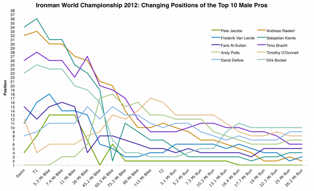
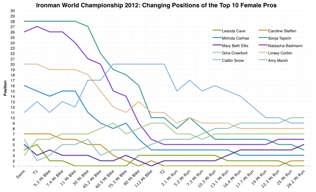
To bring closure to my look at the results from Hawaii I have one more set of graphs and something new. No statistics or analysis, this time a visualisation of how the pro race unfolded last Saturday. There’s enough information within the detailed splits that, allowing for discrepancies, you can follow the changing positions of every male and female pro, but with 52 professional men and 31 women on the start line the result is visual spaghetti. So to minimise the confusion I started with the ten fastest men and ten fastest women on the day.
It’s interesting to see the top ten athletes homing in on their finishing positions and the changes that take place as late as the final few miles. But it doesn’t give a full picture, information is missing. Marino Vanhoenacker led the race from mile 60 of the bike through to mile 16 of the run at which point he pulled out, because he didn’t finish in the top ten his influence on the day is missing. I considered including anyone who was at any point in a top ten position, but twenty-two athletes in the male field at some point entered the top ten. Visual spaghetti. The two charts above are at the limits of Excel’s ability to produce a clear graph. Which is where the Google Visualisation API come in.
Click on an image above for interactive charts of the full male and female pro field at Kona this year. It is still spaghetti, but now it’s spaghetti that can be highlighted making events a little bit easier to follow.
This week has turned into my previous career: Perl development on Tuesday to fetch the data and now some lightweight Javascript to display it. Google’s toolkit is remarkably easy to work with for what it delivers and while it’s not the perfect presentation I’m happy with the results of a couple of hours work. With time more could be done. I am of course pondering how this might be used with the many other graphs I produce – perhaps an occasional interactive power analysis? But that’s sounding even more like my former job.


 Male Pro Race Positions
  Female Pro Race Positions


