Naturally the first thing I did once I’d collected and briefly examined all the 2012 Ironman data was to turn my attention to the 2011 series. After a small amount of cursing and adjustments to my code as I discovered new ways in which the Athlete Tracker page could break I quickly assembled another year’s worth of data and once I had more data I inevitably started to produce graphs – the same high level summary of splits and finish times for the whole of the field. From an analytical point of view they are quick and easy – which counts for a lot at the moment – and they do seem to give some insight into the relative differences of the events.
Scanning down the 2012 graphs on Wednesday you can immediately get a feel for which races have faster bikes or runs, and even in the case of New York where you should have gone for that sub-1 hour swim. Narrower, tighter distributions suggest more competitive fields where athletes tend to finish bunched together, broader spreads suggest the abilities cover a larger range; the skew to left or right gives some overall indication of speed – if you want a fast time, look for a race with a left skew. It would be hard to choose an optimal Kona qualifier from this, it comes down to ability, but a broad spread in an event with a lot of slots is a good option for a fast athlete.
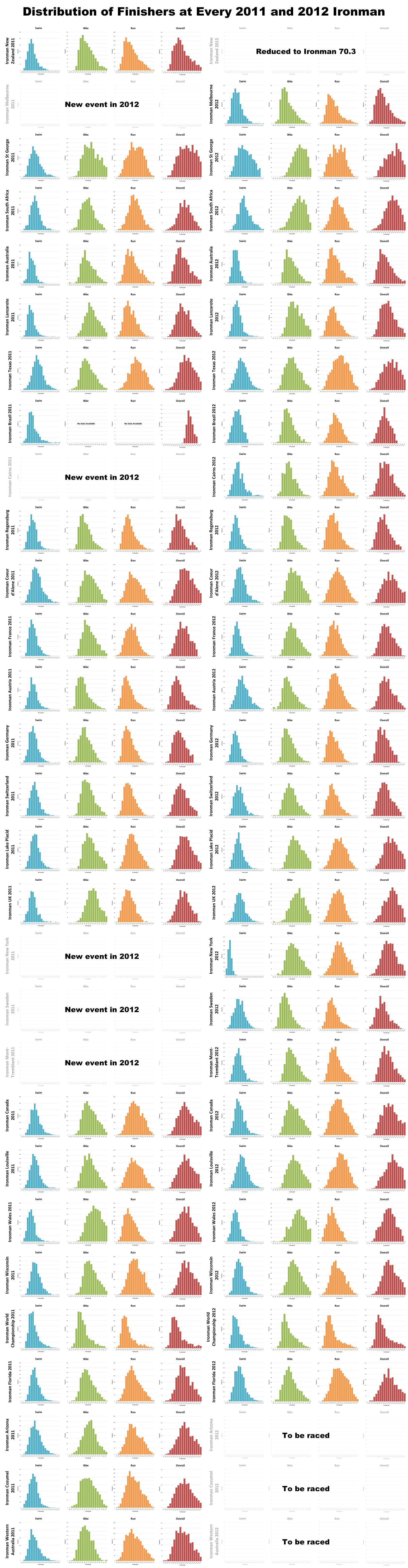
 I was also interested in how the distributions would compare across the years – would events tend to show the same profile both years? The image to the left links through to a larger version (and there’s a bigger 2MB version here if you want more detail) showing 2011 and 2012 side-by-side. A quick scan suggests that for the most part the shapes remain the same, races are consistent in their results over the two year; although you can note events like St. George or South Africa, both hit by strong winds this year, where the bike takes on a more distinctive right skew. Conditions play a role, but overall the course is the bigger determiner of the distribution of race results.
For a more detailed look at the 2011 results, I’ve included all the graphs below. All finish time buckets along the horizontal axis are of the same size (15 minutes for swim, bike and run; 30 minutes for overall) so it’s easy to compare the curves by scrolling down the page. Again I’ll leave you to draw your own conclusions.


