Accompanying the selection of Garmin devices I own are an unsightly mess of cables and the much neater ANT+ dongle that magically transfers data from my Forerunner 610 the instance I return from a run. I can at least be sure my run is logged even if it’s rare I actually use Garmin Connect to examine it – for all the visual improvements and slow trickle of functionality there are better solutions, particularly when, like me, you want to analyse the data. So while I appreciate the simplicity with which my workouts end up on Garmin’s site, I still take the time to manually transfer the data to preferred platforms: TrainingPeaks, WKO+, Golden Cheetah and Strava mostly. But for many Garmin Connect remains the primary – free – means of logging and examining their data and in turn that means there are occasions I need to work with it to examine training history.
Garmin Connect is not a coaching tool. Sharing of accounts is awkward, usually I end up being given temporary access, otherwise it’s simply too difficult to find all the information I need. The Analysis section is of limited benefit – a calendar view of workouts and a summary page of activities, in limited chunks of course. To review a season I need overviews and I need more than summaries of volume, there is only so much that durations and distances tell you, average heart rate in itself says very little. Ideally I want a graph. Before I consider specifics what I really need is something akin to the Performance Management Chart found on other platforms. Garmin offers nothing, it’s prototypical Training Effect doesn’t come close, to review an athlete’s season I needed to make my own.
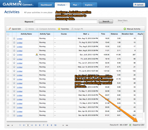
Having spent the last few weeks automating the process of retrieving Ironman results, extracting summary data from Garmin Connect was resolutely manual. There is an Export to CSV option, unhelpfully it only downloads the current page of 20 items with no option to change what is returned. A triathlete fills a lot of pages over the course of a year. Others have developed tools to extract training data from Garmin Connect I’m pleased to discover, but unfortunately none for the Analysis pages. Were this my own data I’d extract it all and import it into a more analytical system, a time-consuming step when quickly reviewing somebody else’s season. I opted for 20 minutes of clicking Export to CSV and Save As to fetch the data I needed for the next step in reviewing the plans.
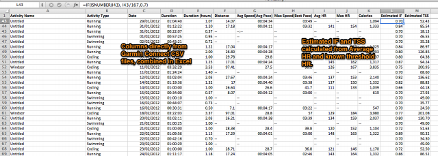
Training Stress Scores (TSS) are the basis of the Performance Management Chart (PMC), they’re calculated by factoring intensity and duration of a workout. I’ve previously estimated TSS either as part of the planning process or using heart rate data from mountain bike rides. I will note, as I did at the time, that estimating TSS from heart rate data is imprecise. However when all that’s available is duration and average heart rate and all I want is to quickly visualise the impact of workload over a season it will do. So a single heart rate value estimates an Intensity Factor (IF) and in turn that estimates a Training Stress Score. I can be quite certain that sessions are being scored too high or too low, but hope that on average it balances out. I’ll admit I cheated with swimming, avoiding the complex estimation process I’d previously tried, and simply assuming that most swims would have an IF of .70 including rest; the swim PMC is effectively based on swim volume. You can access a copy of the spreadsheet for estimating TSS from Garmin Connect data on Google Drive.
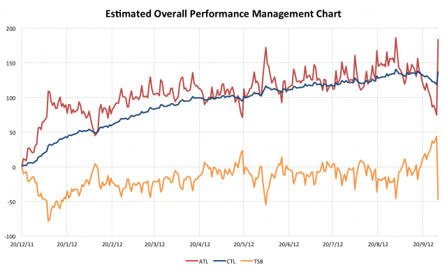
Once I have Training Stress Scores then I need only put the values in the Performance Management Chart Excel spreadsheet I’ve used for planning to produce the above graph. My quick, relatively easy – somewhat imprecise – visualisation of an athletes training stored in Garmin Connect. Sufficient enough to tell me that at the very least he was training sufficiently to keep a steady, progressive growth in fitness (blue CTL) without ever reaching severe levels of fatigue. Had I seen significant declines in fitness, moments of major fatigue or patterns of inconsistency I could have been more targeted in my review, but at this heavily filtered level it would appear that training has been largely text-book. Which left me to the deeper examination, building up a picture of individual workouts and patterns over the year to understand what were the athlete’s next steps.
From Garmin Connect summaries to a quick and easy visualisation of a season’s training. It fulfilled its purpose – a starting point for a more thorough review. In this instance, the real answers were hidden within the weekly combination of sessions and how the athlete performed. Potentially the usage of the summary data could be expanded, it will never offer a detailed insight, but there is a role for graphing weekly volume and perhaps showing changes in average heart rate over a season. Currently Garmin’s Analyze section leaves a lot to be desired

Ironman Training Library
From nutrition to pacing - a collection of CoachCox blog posts focused specifically on Ironman training and racing.


