If your interest in Ironman rankings doesn’t stretch beyond where your results or races lie in the tables, skip this post now and try this one instead. For those who remain today’s blog aims to explain the work involved in reducing a database of 60,000 results to an ordered list of 28 races. Basically this is geek triathlete territory.
Standardisation has been the largest challenge in unifying results and in real terms it is still far from complete. Almost every piece of data extracted from IRONMAN.com requires some degree of scrutiny, whether it’s converting different standards of country names – ISO, IOC, a combination of the two – into one or correcting age groups. Occasional mistakes are an inevitable feature of any large data set, but the time required to make the Ironman results workable points more towards a lack of care. Results are recorded by local timing companies and whatever they provide goes straight into the athlete tracker – the quality varies significantly. Since the first race, Ironman Arizona, was inserted in the database I’ve spent hours standardising data to the point I could use it.
Last week I’d reached the point where I felt I could attempt to link every athlete at Kona with their other results. I would expect to at least find a qualifying race (I’d forgot about lottery, legacy and 70.3 qualifiers at that point) for each individual. I mixed obvious automation – comparing name, gender, age and country – to capture and associate two thirds of the results before spending a laborious Sunday afternoon matching the remainder by hand. In the process I learnt enough to further extend and automate the matching process beyond Kona. Balancing the probabilities of name, gender, age, country and state matching against the chance, however small, that two people of the same name, and age, and gender came from the same country and state. I matched cautiously to minimise those odds which left me with a second larger manual task, but this time I was smarter and built tools to suggest matches and allow me to rapidly identify combinations. I spread the work over a number of days. It remained tedious.
The interesting part began once I’d identified the majority of athletes who had raced multiple events. I now had a network of links between races which could form the basis of a ranking system. There are always assumptions, mine was that on average the performance of individuals across multiple races would be consistent enough to allow meaningful comparison, or more simply that bad days (or great days) were rare enough not to skew my approach.
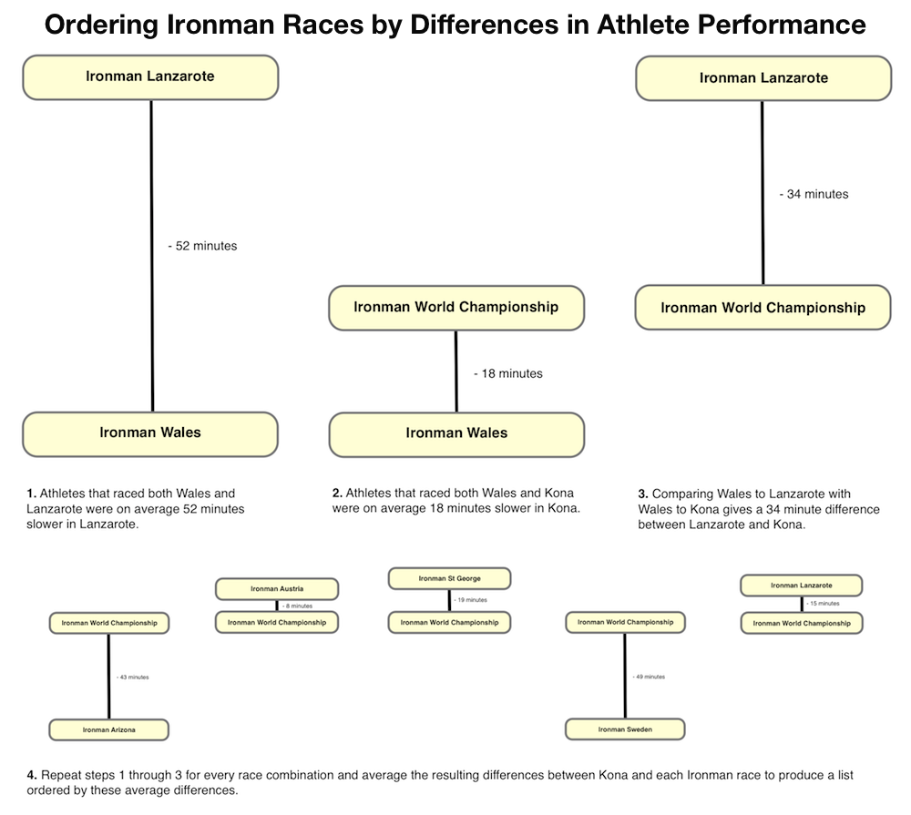
Firstly I gather the results for each athlete that had raced multiple times in 2012 and compared them, storing the differences between race times. This gave me a list of differences in race splits for each race combination which I could then average. As the example above shows the result is a difference between Wales and Lanzarote alongside a difference between Wales and Kona, which allows me to calculate a difference between Lanzarote and Kona. Of course I also have a difference between St George and Lanzarote along with St George and Kona which provides another value for the difference between Lanzarote and Kona. By working through every race combination I built a set of average differences between each Ironman and Kona derived from my network of athletes. I averaged these averages to produce the time differences and rank the results accordingly.
The final tweak that enabled a degree of control over the list was setting a threshold: one race combinations were rare, few athletes race both events, in these instances there was a greater potential that an outlier would skew the results. Too high a threshold and already poorly connected races, like Sweden, begin to drop from the table; too low a threshold and somebody’s bad day suddenly pulls an otherwise fast Ironman down in the rankings. I ignored average differences for connections with fewer than 3 athletes.
The list remains a work in progress – on the basis of a comment on last Thursday’s blog I’ve tried using medians instead of means to better remove the influence of outliers, but the results below don’t feel right.
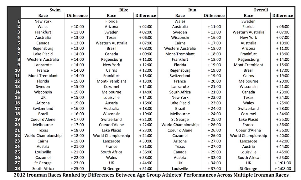
There is an element of subjectivity – choosing the approach to averaging, choosing the threshold – it means that while the ranking is automated there is also my own input in the final list. The athlete connections between races seems a sound basis for comparison (although the data set is relatively small), but I selected and refined an approach to best match my perception. I did say this was a far from perfect solution.
Hopefully this was of some interest for those who made it to the end. The process of explaining the rankings has already seeded ideas for new variations, for example eliminating results outside a certain percentage difference (course allowing) as outliers. Refinements will come for a 2013 version, the major hurdle to examining past results is the volume of labour required to make them usable.
