After a stormy 2012 that battered athletes and slowed finish times across the board Ironman South Africa returned this year with a more text book edition of the race. In contrast to those racing, having pulled out of Brighton Marathon, I spent a lazy Sunday following updates on my iPad. Athlete Tracker’s tables of numbers aren’t the most exciting form of spectating, but knowing some of those chasing Kona slots created some excitement. Once they were home I moved on to other things, but this morning, before I headed to the pool, I started the process of retrieving results.
As usual I’ve uploaded the full results and splits from Ironman South Africa 2013 in spreadsheet form and then used that data to examine the race in more detail; starting with the distributions of finisher splits below.
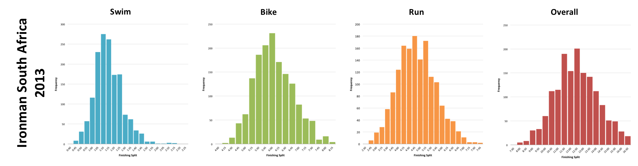
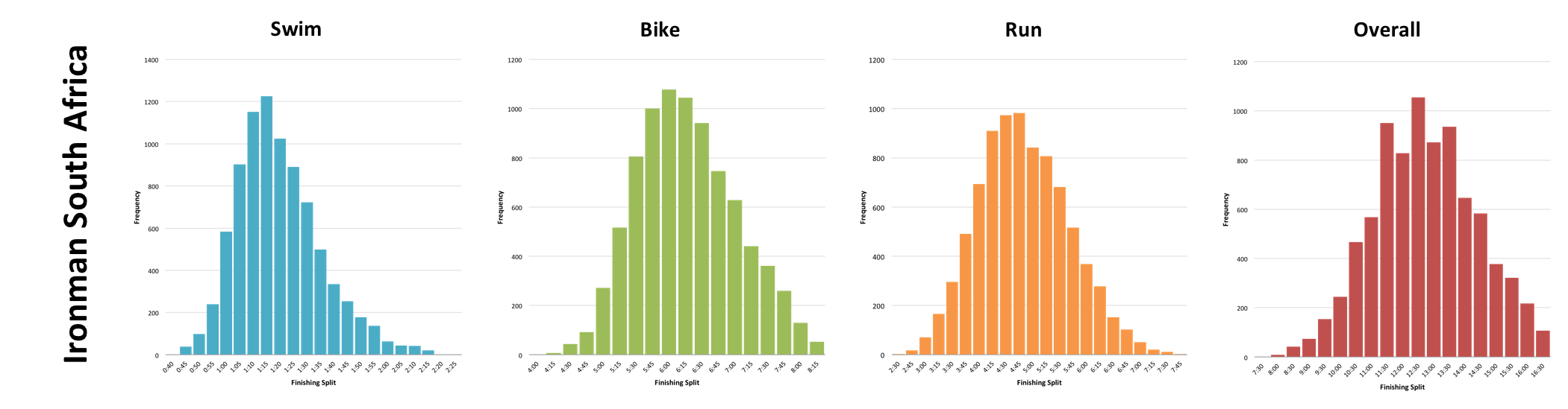
The first set of graphs show this year’s event, the second show the distribution of splits from 2007 through to 2011. I’ve excluded 2012 partly because it was unusually slow, but also to save time updating the to graph incorporate it; it would cause a very slight right shift in the distributions. Without 2012 present it appears that 2013 was slightly faster than the typical distribution in both swim and bike, but the run and overall finish times show less of a shift. The net affect is 2013 looks to have been faster than usual.
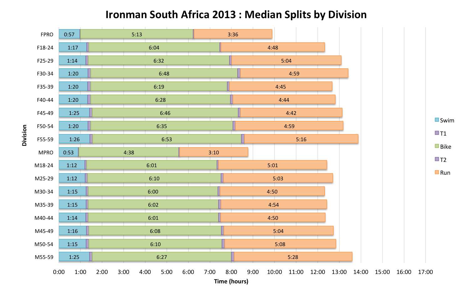
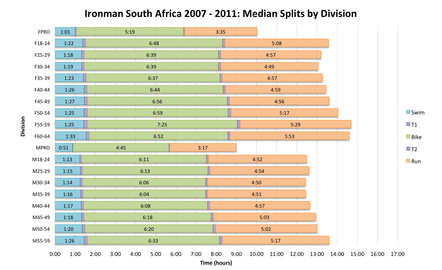
We can further examine this by looking at median splits within each age group – the first chart shows the results from 2013 while the second covers the period between 2007 and 2011. Again swim and bike are slightly faster than usual, but run shows a less distinct pattern of improvement. Some of this will be due to variations in condition and some due to variations in the quality of the field. My impression is that race times benefited – particularly in swim and bike – from good conditions on Sunday, but it’s hard to establish if the field was stronger from medians alone.
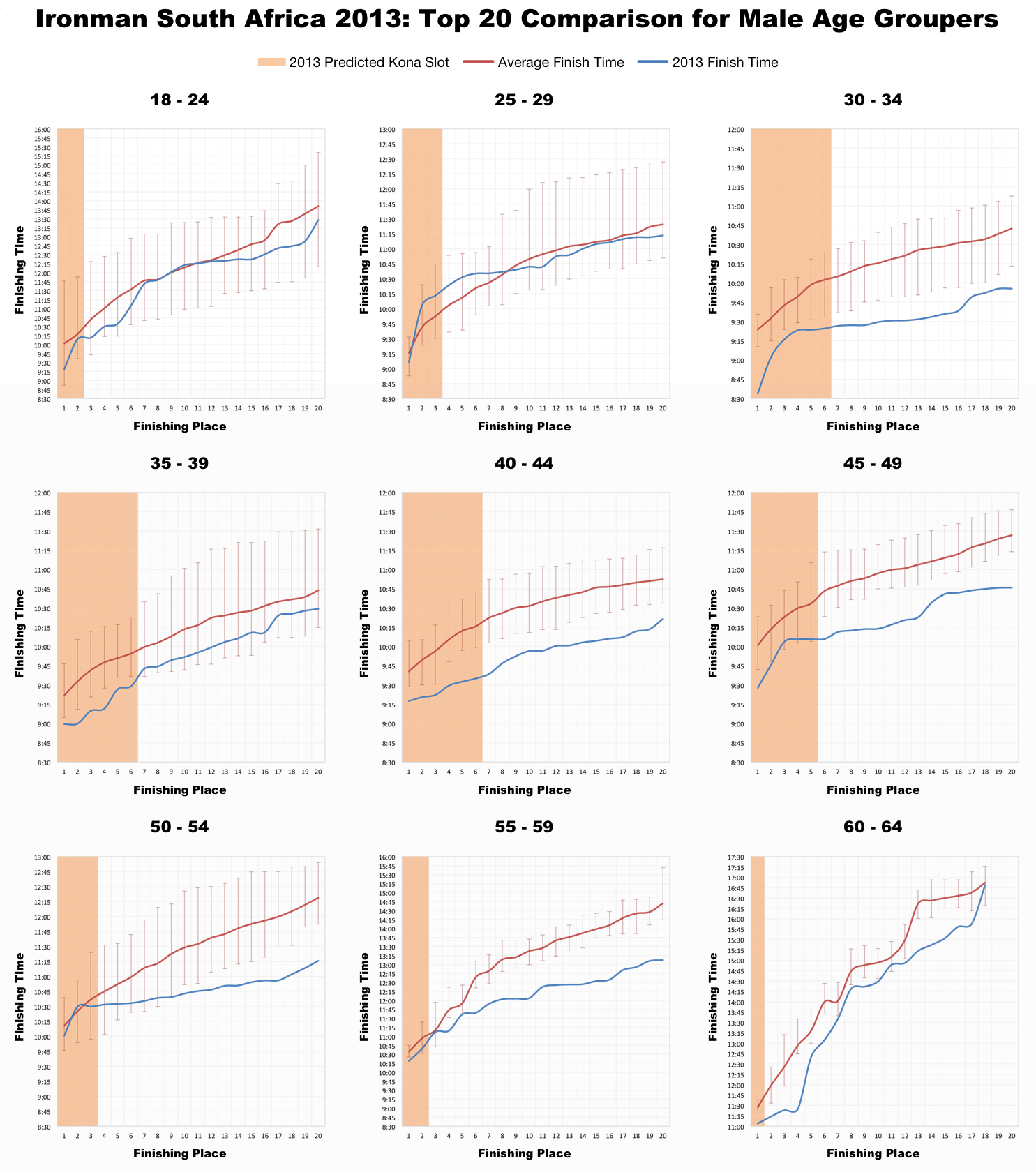
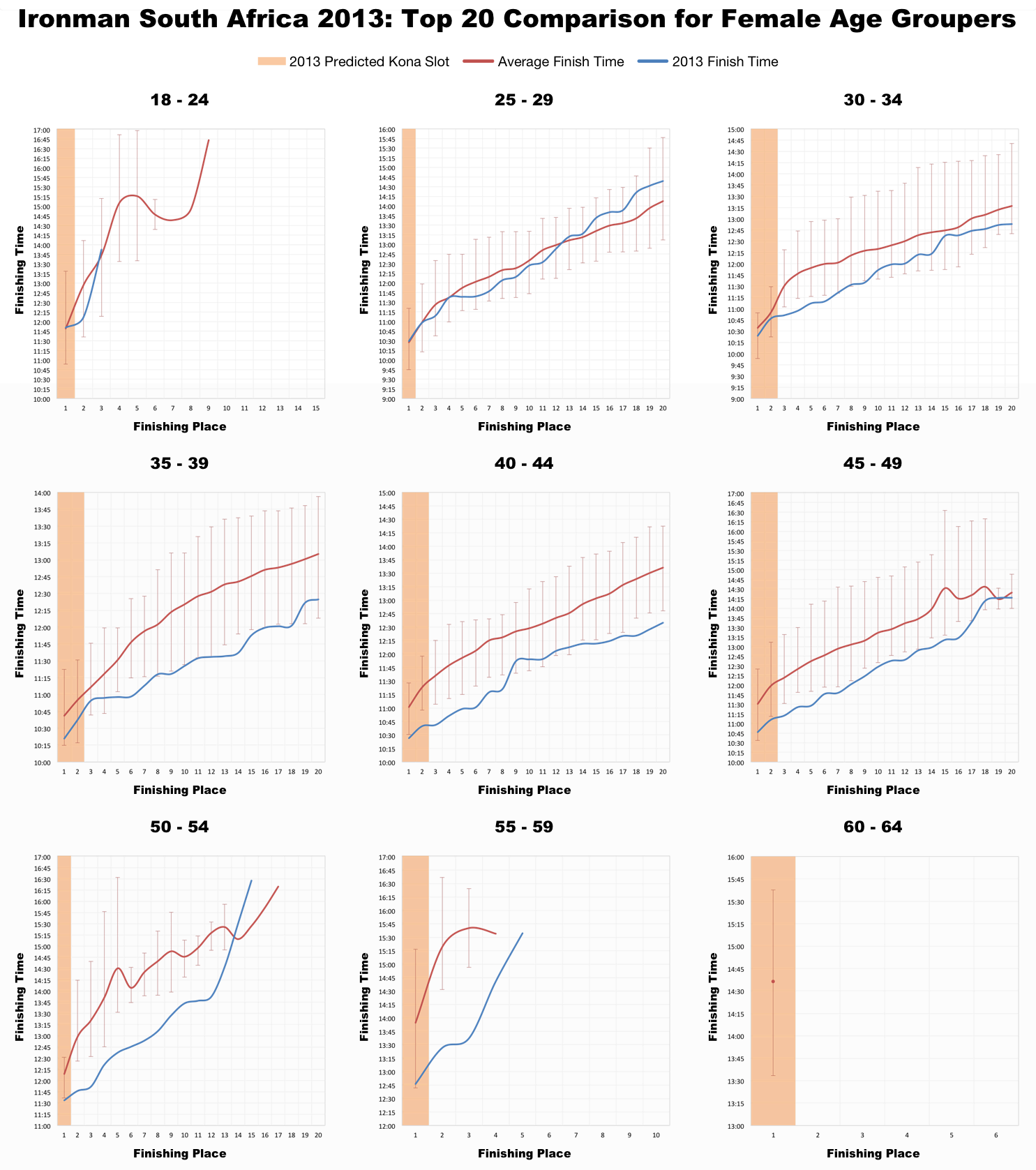
It’s when I look at the top age group performances that I really see the difference: a strong picture of faster than average finishes across all age groups forms, with many setting new fastest times for their finishing positions. At the front of the pack there was clearly a much faster race than normal. The interesting question is whether this is faster than conditions would suggest – was there more competition for Kona slots this year?
Clearly Sunday was a favourable race day; it’s rare to see such a consistent pattern of above average performance in the age group top twenties, that consistency lends further support to the impact of beneficial conditions. However it’s also clear that there were strong athletes present who not only performed above the average, but faster than previously seen for their age group position. It’s that step up in results that leads me to believe that there was more competition at the front of the pack. Adding Kona slots may not do much to increase overall athlete numbers, but it does appear to influence the make up of the field a little.
Had you used my charts of Kona qualification times prior to the race you may have been disappointed. A combination of good race conditions and a slightly stronger field resulted in a lot of fast age group times at the front of the race. Not that it’s ever easy, but this was not an easy year to chase a slot at Port Elizabeth.


