I had a good idea what to expect when I downloaded and analysed the 2014 Ironman South Africa results this morning. Splits from my athletes on Sunday had quickly established that under race day conditions the new bike course appeared particularly slow. Looking at the results in detail confirms it wasn’t just those I coached – the field in general was significantly slower on the bike this year.
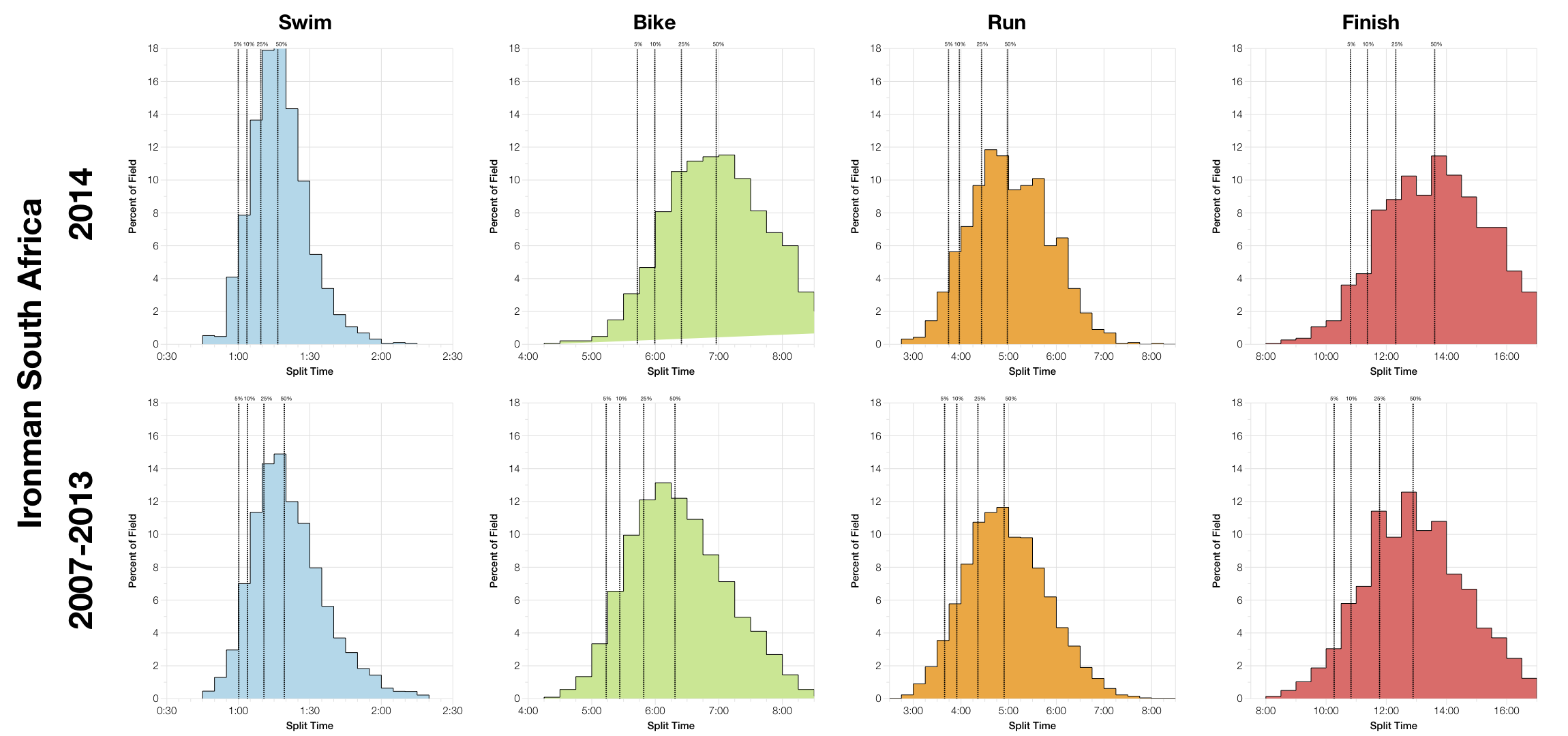
The distribution charts speak for themselves: comparing 2014 with previous years (themselves a mix of faster and slower race days) the bike was heavily weighted towards slower times and as a result so were the overall times. The difference is significant, easily outweighing the slightly faster swim distribution and probably leading to the slightly slower run distribution.
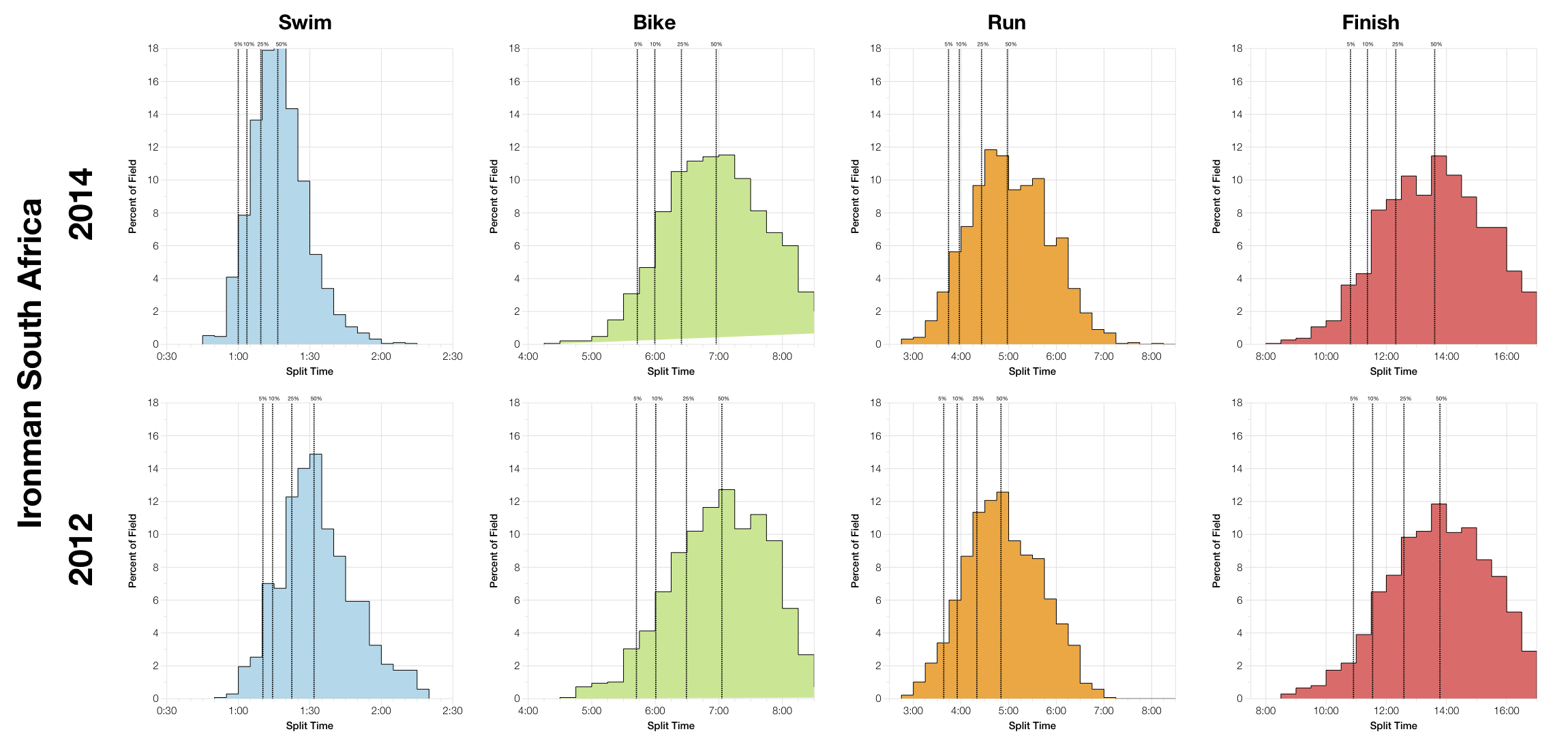
Ironman South Africa has seen tough bikes before. If we look back at the 2012 results the two races are broadly comparable; other than this year’s much faster swim distributions and averages don’t deviate much between the two.
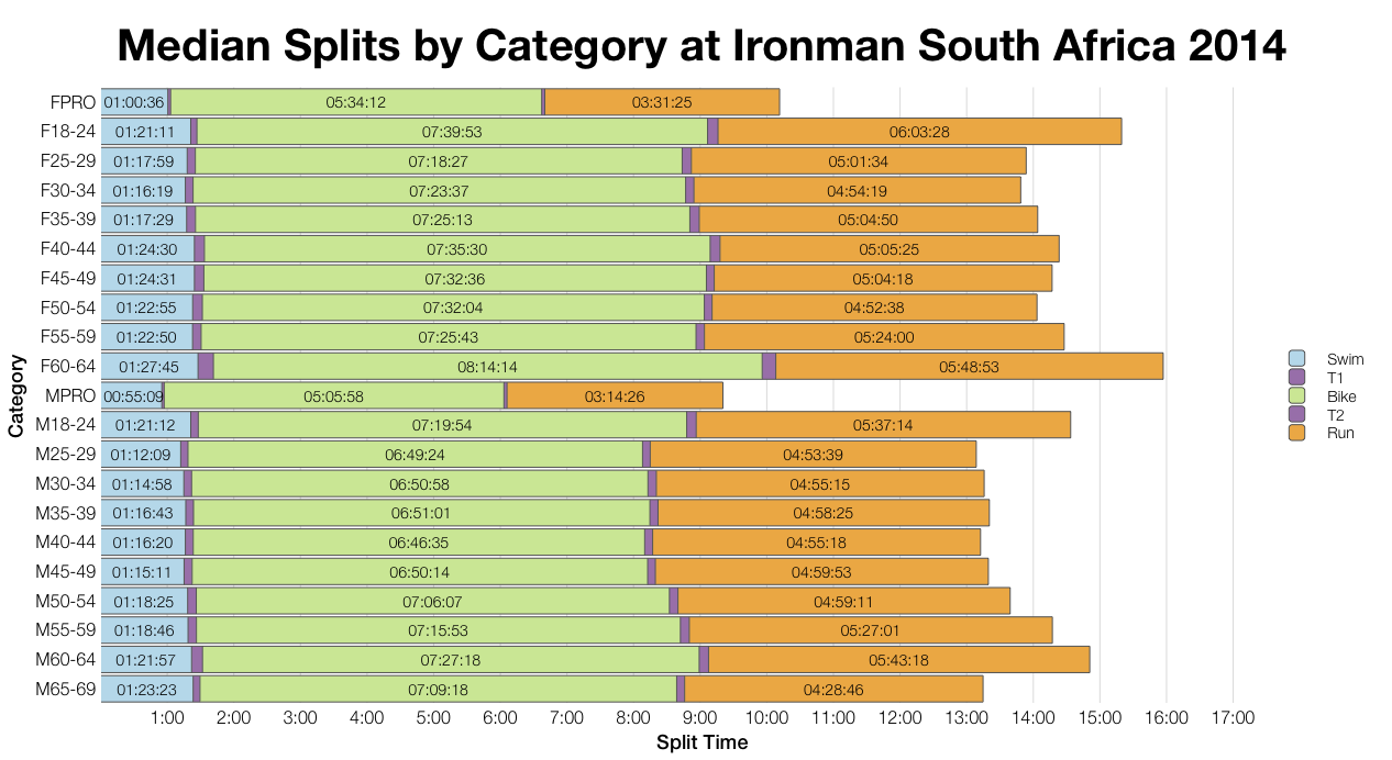
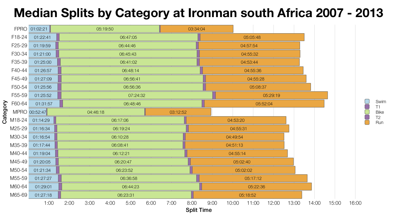
Comparison of median split times supports the pattern almost universally – swim very slightly faster, bike much slower, run very slightly slower. The slower median bike trend even holds among the professionals too – conditions and the new course had a clear impact on splits across the field.
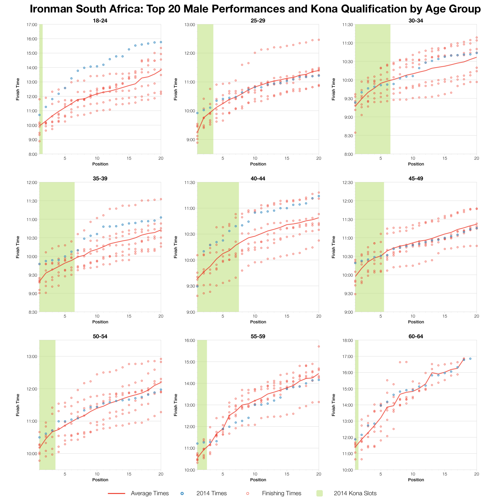
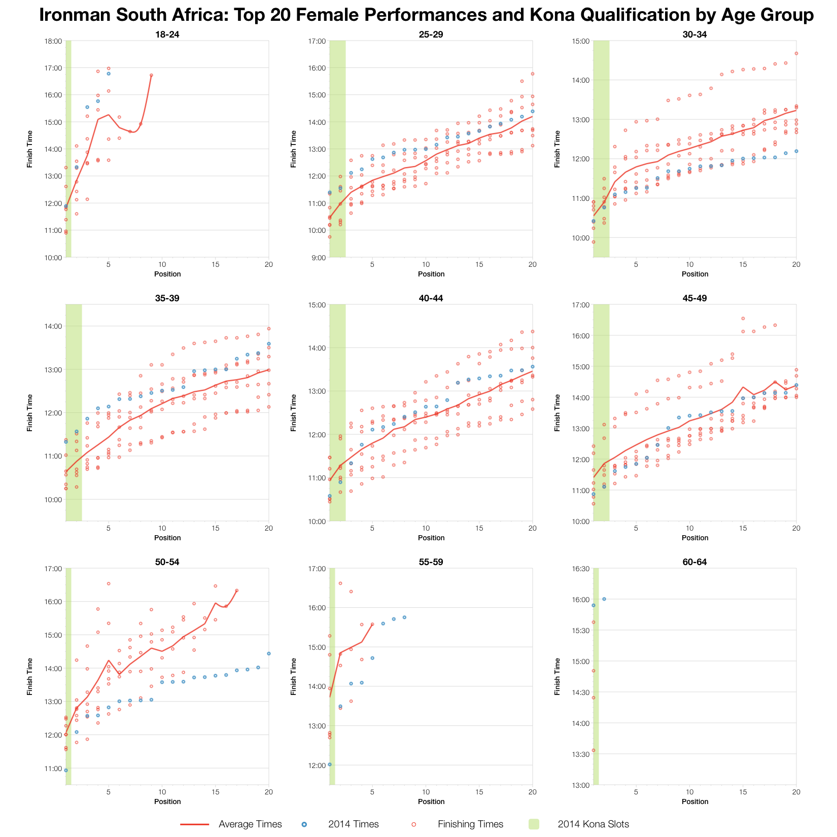
When we look at the results for the top 20 in each age group compared with past races the picture is far less clear. In some categories times were at the very slow end of performances in South Africa, in others they trended marginally faster than average; in the case of the F30-34 age group some times are faster than previously recorded. Year-on-year variations in the quality of the competitive age group field has huge impact on race outcomes and is probably most notable in smaller categories. Certainly in the larger men’s field and the major age groups under 50 the impact is clear – top 20 times are at best average for South Africa in these consistently competitive fields. It should be noted that year’s change in course makes comparisons with the past difficult and largely superficial.
It’ll take a few more years of results to have a sense whether expectations at Ironman South Africa should be set lower (from a time perspective). The new bike course clearly gives the potential for a much slower day under the right, or rather wrong, conditions. At the same time the front-of-pack athletes continue to develop and the affect of tough conditions is less obvious in age group winning times.
As usual I’ve put a spreadsheet of the full results and splits from Ironman South Africa 2014 on Google Drive.


