The season is starting to pick up – another weekend and another Ironman raced. This time it was Ironman South Africa, now the African Regional Championship, a title that brings with it 75 Kona slots. The last time we saw an increase in slots at South Africa we also saw a boost in entries from outside the region. This year overall numbers are down on 2014, possibly a consequence of tough conditions at last year’s race, but the proportion of foreign entries is the highest seen for the event. Did extra slots bring extra competition?
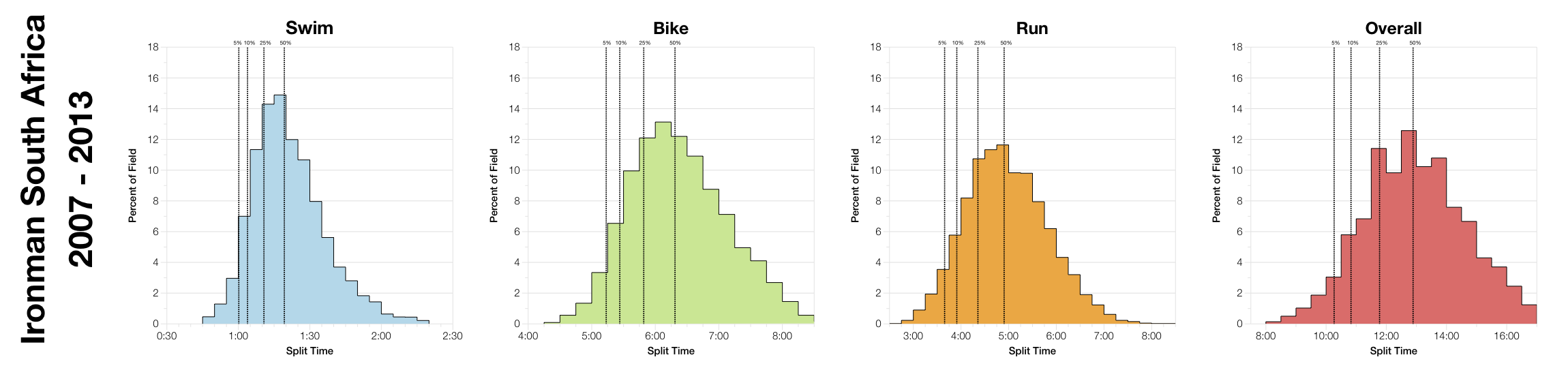
In 2014 the bike course was altered which, along with high winds, resulted in a slower race. So for this analysis I’ve separated out the 2014 results so like-for-like courses can be compared.
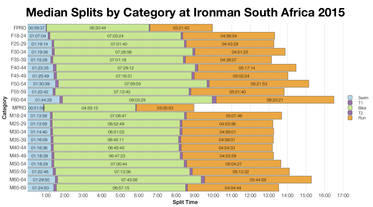
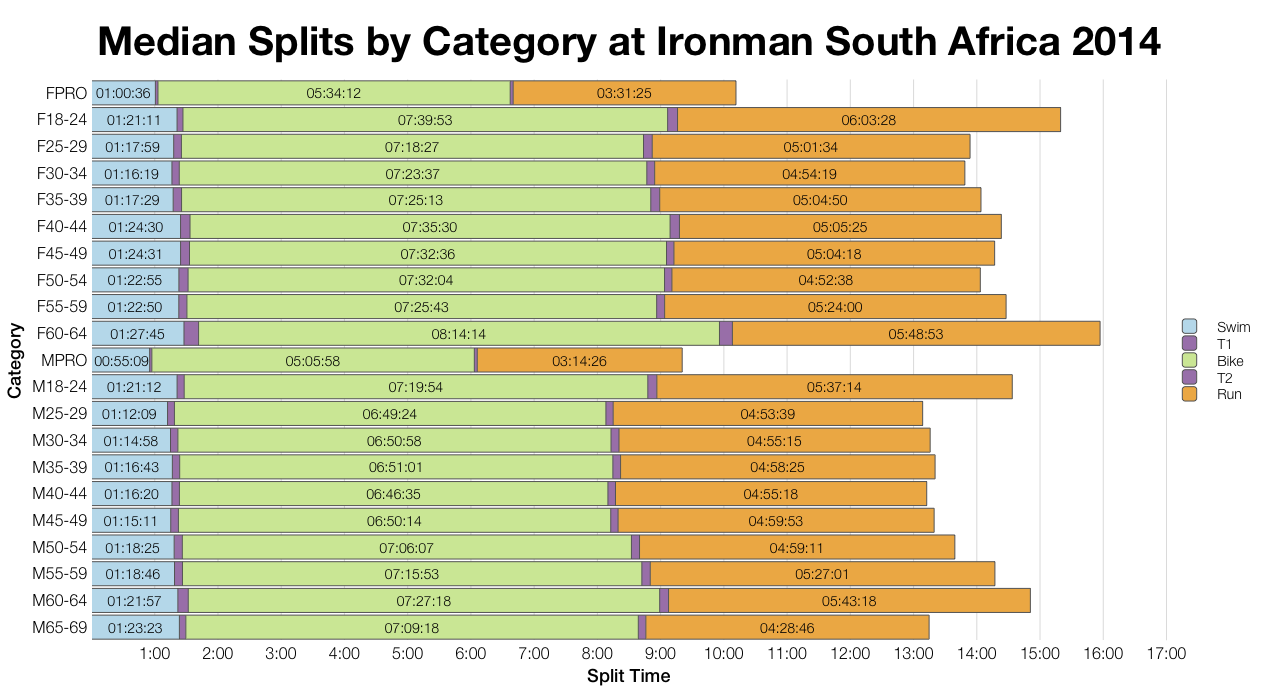
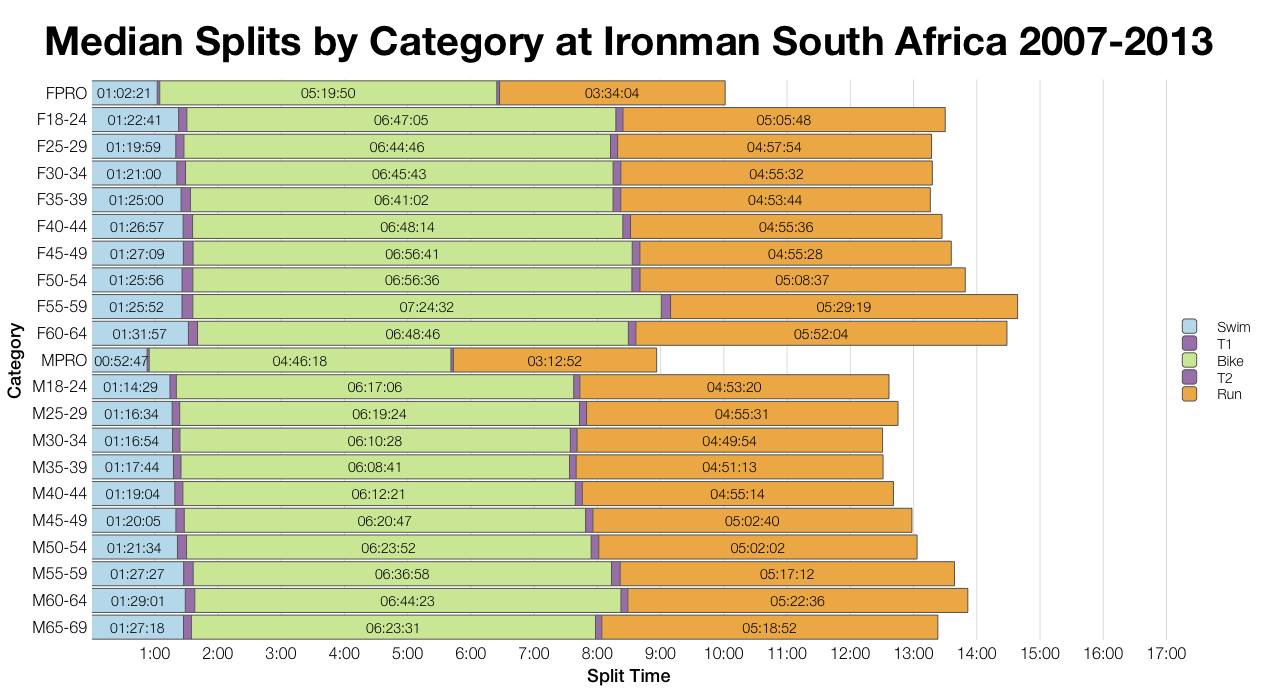
There really isn’t that much difference between the median splits this year and in 2014 (same bike course). There’s a little more variability in the female age group splits, but this could result from the smaller field size; otherwise the two years are remarkably close. The male pro results might suggest a slightly faster bike this, but the affect isn’t as obvious amongs the age groupers. Comparing back to the previous course (2007-2013) and bike times are consistently slower since the change.
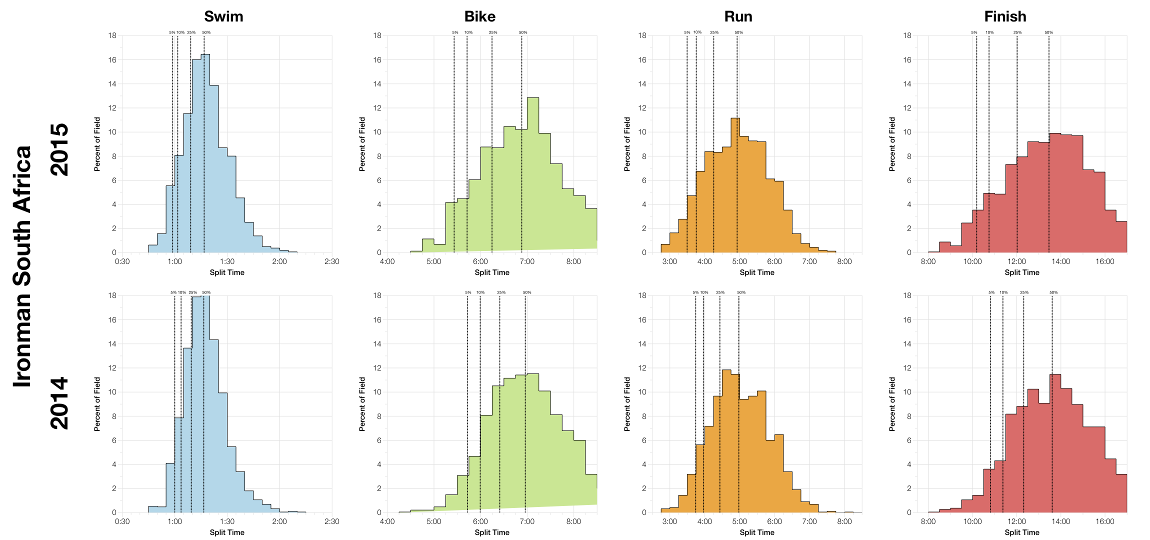
The split distributions suggest that this year’s bike was faster than the year before, especially at the front of the field. There could be a number of reasons: a broad spread of abilities in the field, worsening conditions as the day goes on or a particularly strong front of pack in this years race among them. Exact causes aside there’s more weight at the front of the bike than in 2014. The 2015 run is also very slightly faster and again this is mostly coming at the front of the race. The net result is a faster finishing distribution than in 2014.
Comparing back to previous years and again we see that the new bike is slower and consequently so is the overall race, but otherwise results are similar.
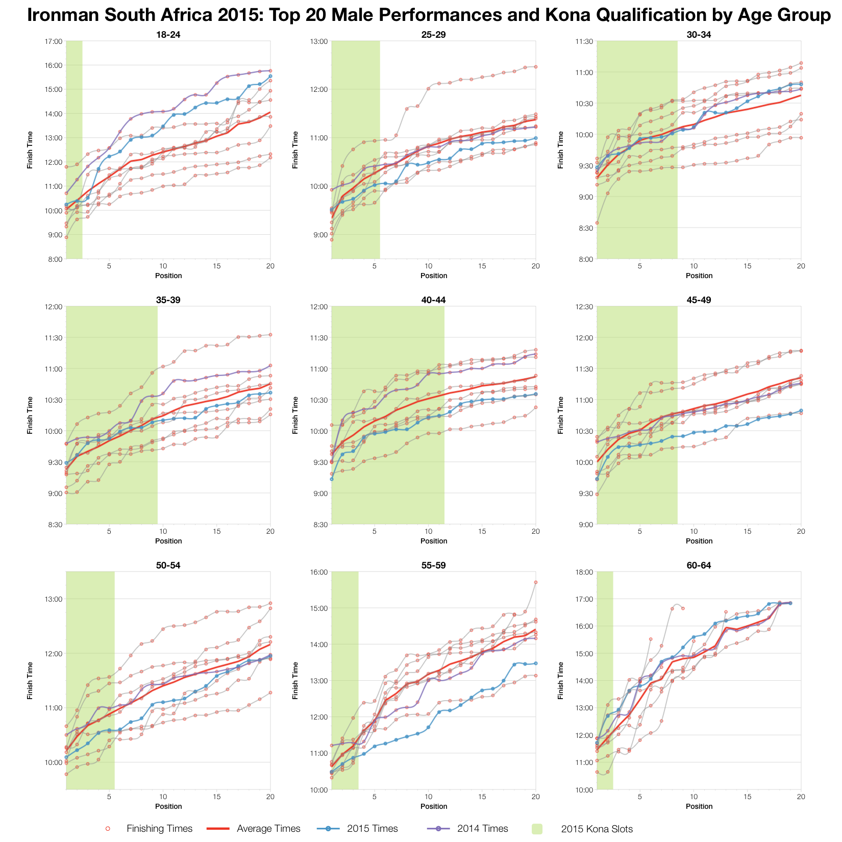
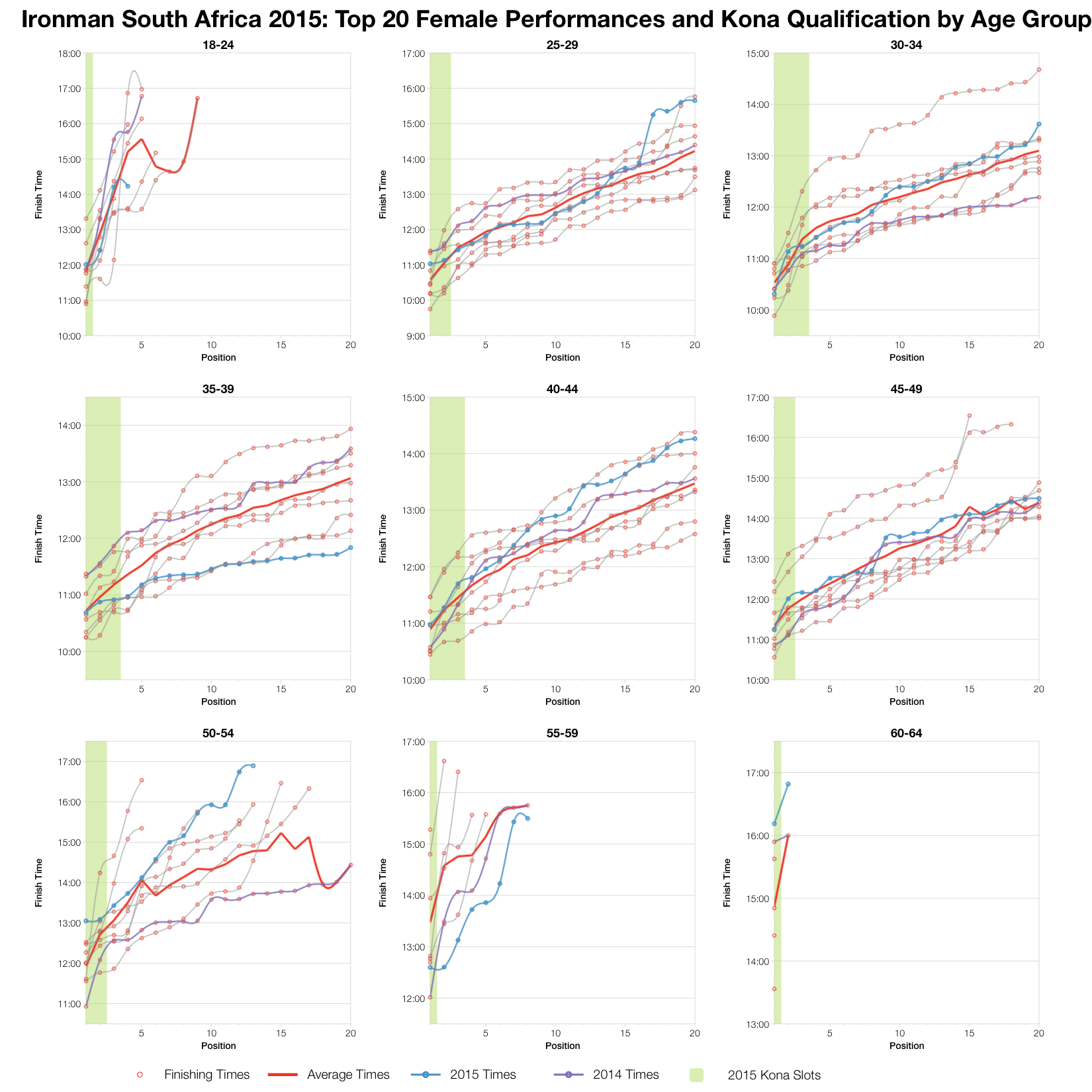
Looking at the front of pack race we can note that generally top twenty times were a little faster than the average (which includes all previous races) and more specifically faster than the 2014 race (in purple). At least for the men’s field; in the women’s age groups the picture is less clear – some are faster, some slower. The trend from twentieth through to first place doesn’t vary much from either the average or the 2014 results; there are similar differences between each placing at the race. It suggests levels of competition at the front of the field were on par with previous events.
As usual, you can access a spreadsheet of the full results and splits from Ironman South Africa 2015 on my Google Drive.


