I’ve spent a lot of time attempting to identify and rank the differences between Ironman races and their results, but for a change – a small change – I thought I’d lump the whole of 2012 together and look at what a broad overview might show. I was curious, as I was when I first started examining race results, to see if there was evidence supporting Ironman racing lore, or if I might gain insights that athletes and coaches could apply to their preparations. The average Ironman, if such an athlete exists, swims a 1:19, bikes a 6:20 and runs a 4:51, that may not be you, but perhaps such generalisations can help us better understand our circumstances on race day.
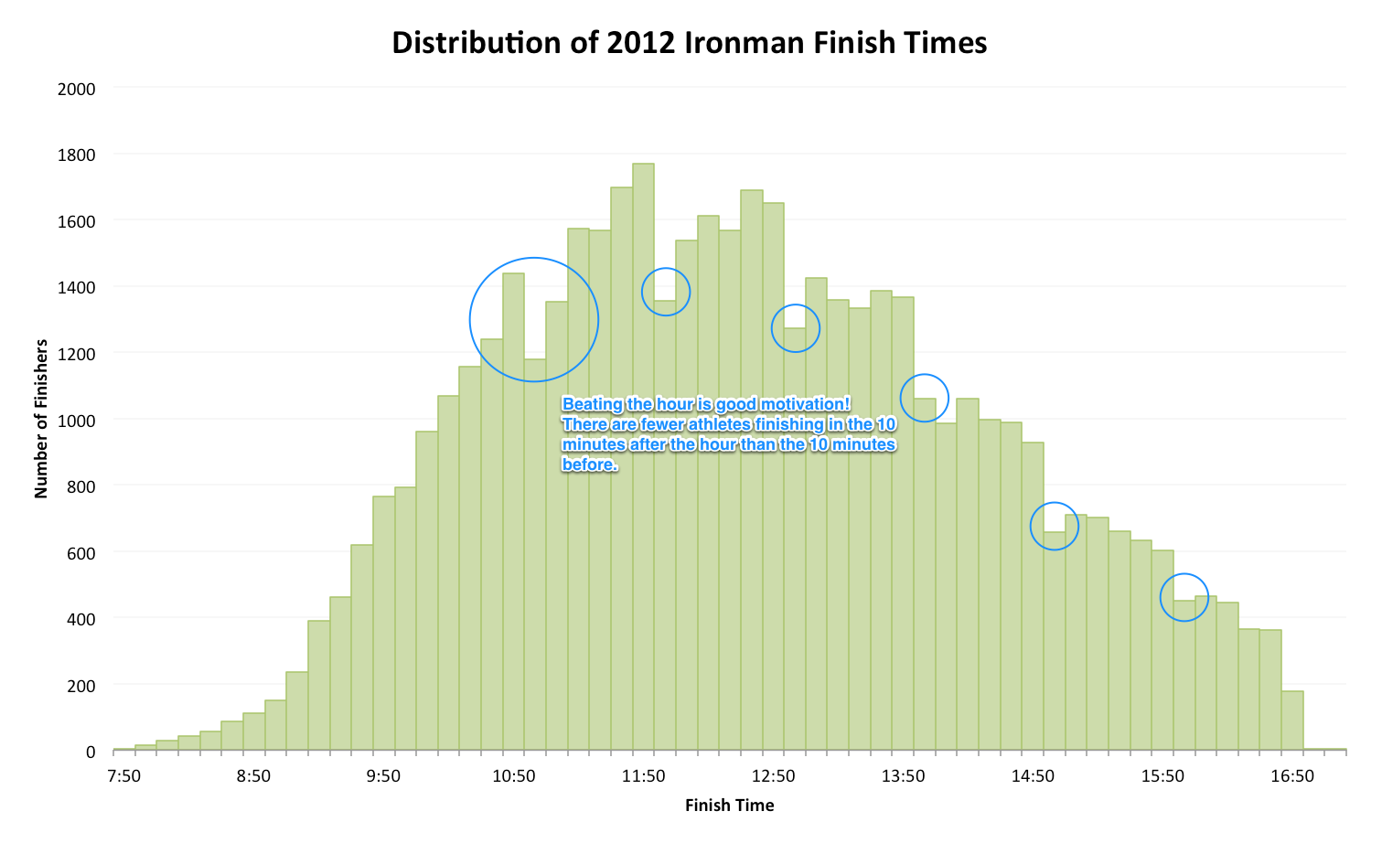
While individual race distributions hint at the nature of courses, conditions and quality of fields these features are lost at a higher level. Differences combine to fill out a long-tailed histogram, fat in the middle and swiftly tapering down to the fastest times; there are many more slow athletes than their are quick ones. The broad pattern may be uninformative, but for overall finishing times, above, the chart highlights the powerful motivation of finishing within a given hour. At each hour there is a significant drop off of finisher numbers in the 10 minutes after that hour than there is before. That desire to finish by a specific time spurs athletes on resulting in a stepped affect on the graph.
If you want to learn something from this it’s probably the significance of good motivation: without those round time goals in mind, would we see this influx of athletes just under the hour?
Interesting as the impact of arbitrary goals on race performance is the data I actually wanted was the average breakdown of Ironman splits. How a sub-10 Ironman should be achieved is a frequent topic of discussion, at least for me, and the answer usually takes the form of a 1 hour swim, 5:15 bike and 3:40 run allowing some time – not much – to enjoy transition. I wanted to know what the typical splits were, on average how does a sub-10 hour Ironman divide their time?
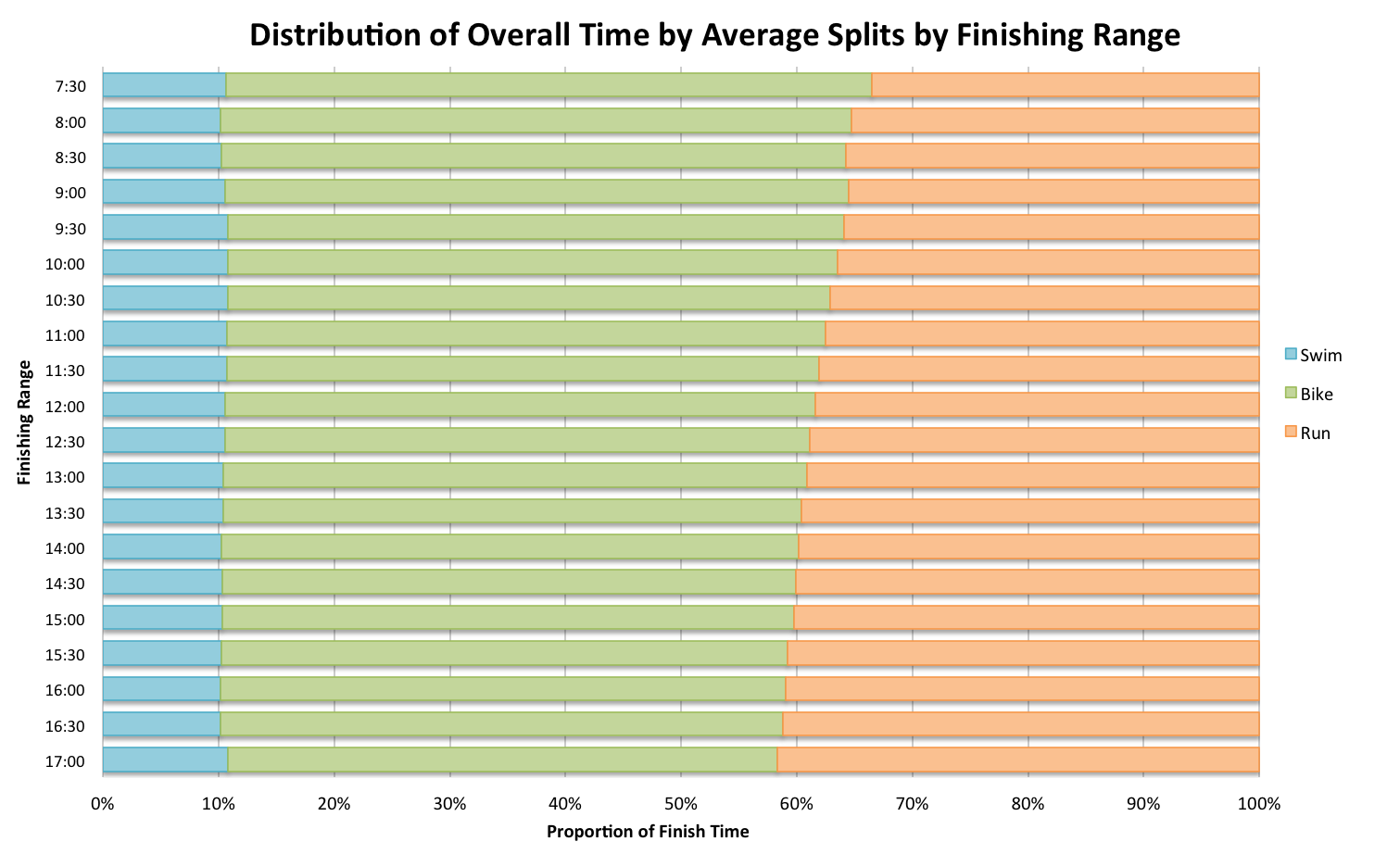
The answer is they spend 10% of their time swimming, 53% of their time cycling, 36% of their time running and the remainder messing about in transition, my previous estimates are spot on. As we’d expect slower finishers have slower splits across the board, but while swimming slows at a rate that maintains its position as 10% of the race, running slows much faster and its proportion of the day increases. The impact of a 6 hour versus an 8 hour bike seems relatively small in comparison with the equivalent shift from a 4:30 run to a 7 hour marathon.
What can we learn? The bike is always the biggest portion of an Ironman and with its influence on the run it is the area we should – mostly – focus our attention on (generally speaking). Because we are not all average athletes we should determine our own target splits for a particular goal and their realism in training; this chart might be consider a guide to the norms. And it’s tough being a slower athlete, not so much for the longer bike, but that long run/walk that follows.
For the sake of completion, and because I get a little obsessive, I also produced the splits for age groups.
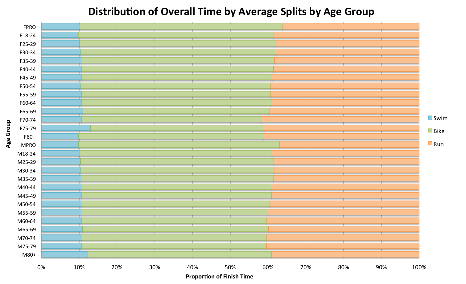
We effectively see the same pattern where age correlates with slower average finish times and so the proportion of bike to run shifts accordingly.
Which leads to the final chart: the distributions of splits by territory: how do North Americans and Europeans compare?
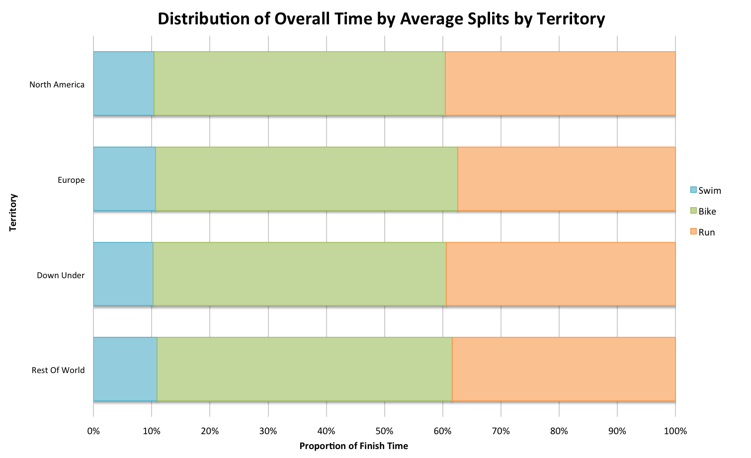
Bike heavy Europeans, fast swimming Australians… More interesting are the numbers behind this chart and the process of comparing regions across the entire year of results. A hint towards a future topic, the promised comparison of European and North American performances across the race season. However I’ll save that debate for another post along with discussion of the validity of lumping everything together.
Briefly diverting onto the topic of split ratios has satisfied me that, to be honest, they don’t really tell us that much. The average values won’t necessarily relate to our own circumstances where strengths and weaknesses may alter the distribution of our finish time and the way we train for it. Perhaps they suggest the importance of running in faster finishing times – it feels like the marathon is the bigger differential of performance at the front. As with many of my forays into the database there are potentially interesting asides, I’ve discussed with Thorsten the idea of identify performance types by the ratios of split, it might offer another perspective in determining if you need to adjust your racing strategy.
