The tenth anniversary of Ironman Western Australia appears to have been a good day of racing with times trending faster than average on the course. I can’t tell you how much came down to the conditions or to the athletes who turned up on the day, but I can look at how these results compare and what that meant for those looking to qualify for Kona.
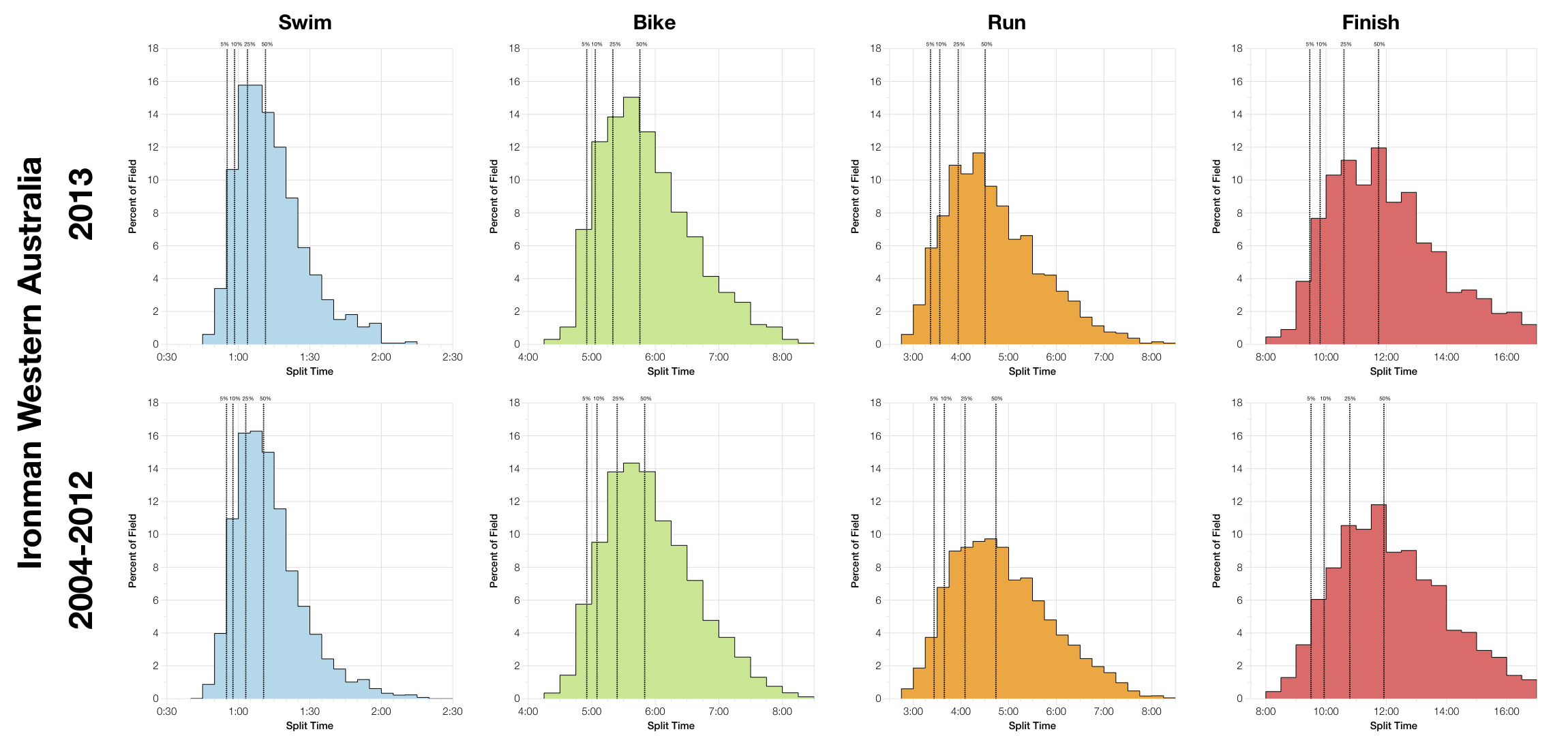
The chart above allows us to compare the distribution of finisher splits at this year’s race with the previous 9 years of results. Visually the graphs are very similar, suggesting the conditions and field weren’t hugely different from a typical race in Busselton. The dotted percentile lines better reveal that this year was a quicker race. Both bike and run show greater weighting towards faster times, it’s subtle at the very front of the field, but once we’ve reached 50% of the finishers there is a noticeable difference in times. Naturally this results in a similar trend in the overall finish times too.
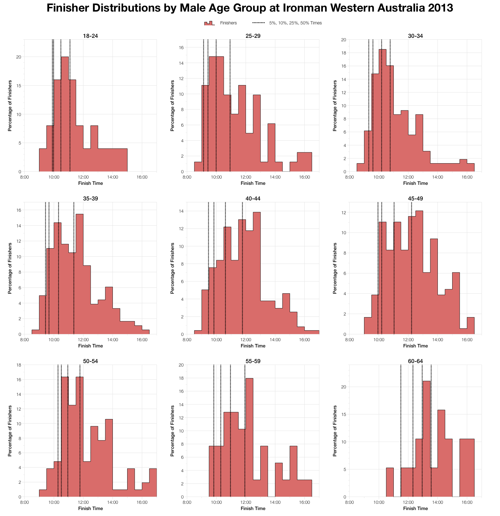
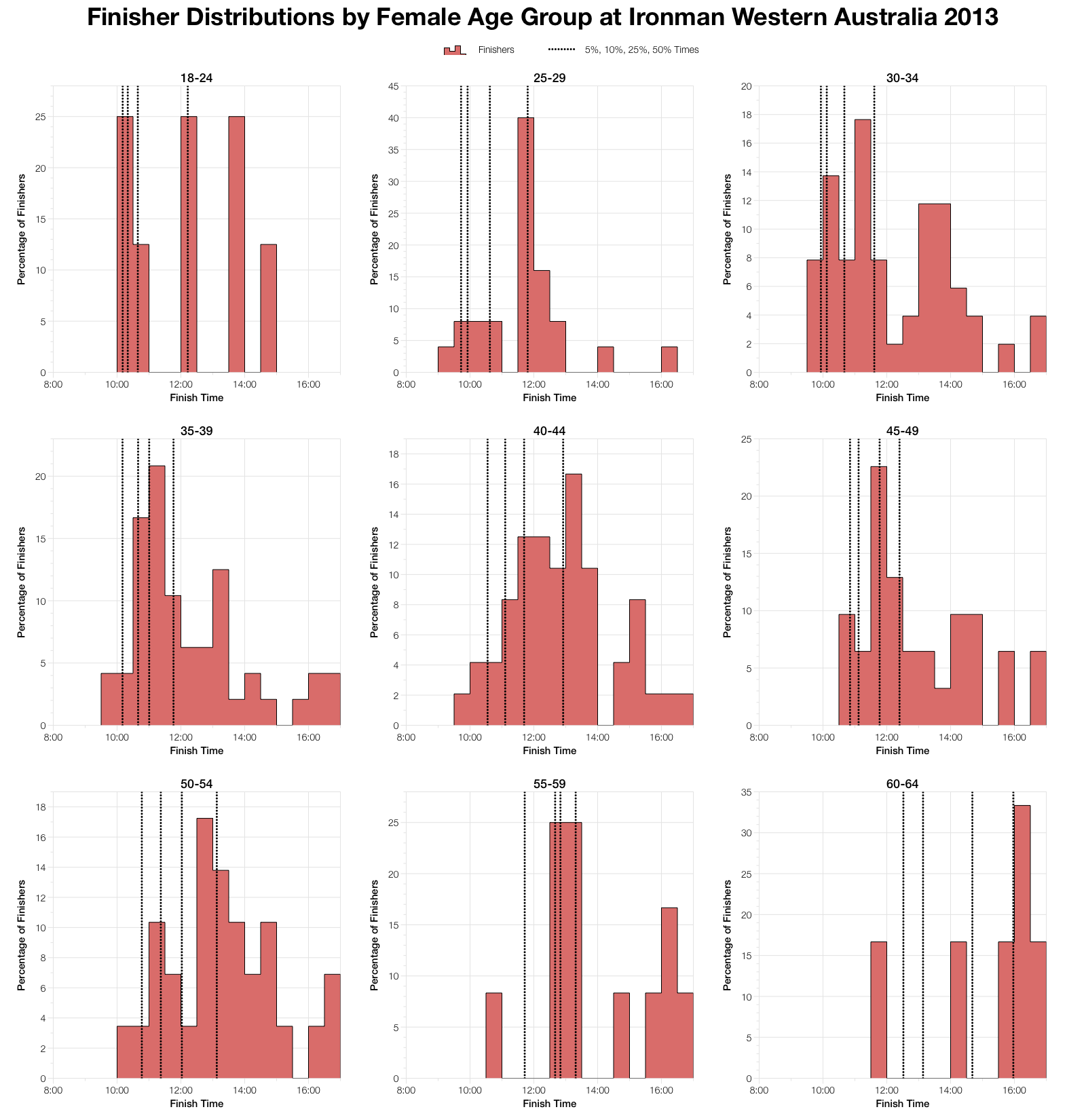
For added detail we can also look at the finisher distributions by age group. What this shows is how the distribution of performances vary with age (and to an extent age group size). Unsurprisingly performance declines with age, although in Western Oz the peak starts younger at 25-29 than it does in many other Ironman races. It’s not unusual to see the peak performances delivered in the thirties at Ironman. Many of the women’s age groups are comparatively small, but the trend holds true there too.
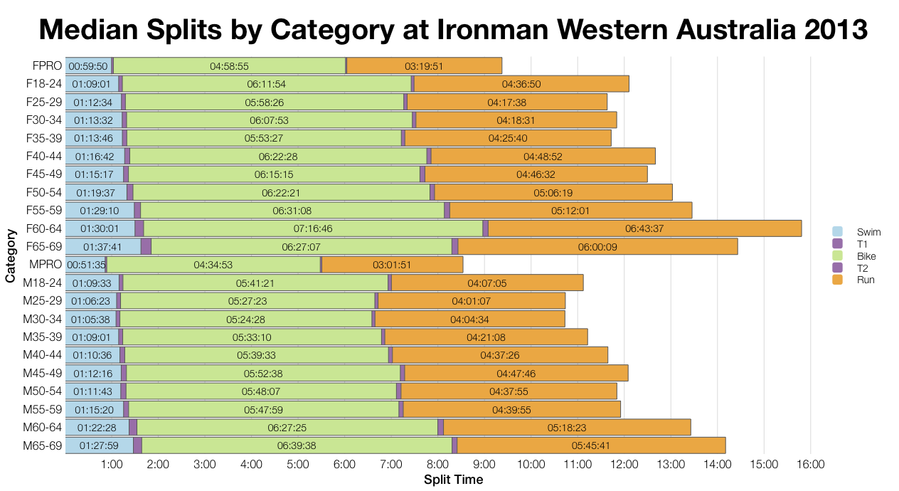
For confirmation comparing this year’s medians with the previous 9 years agrees that bike and run were faster. As commented earlier at the 50% (median) point the difference is actually reasonably large by Ironman standards. So, whatever the cause, 2013 was a good year in Busselton.
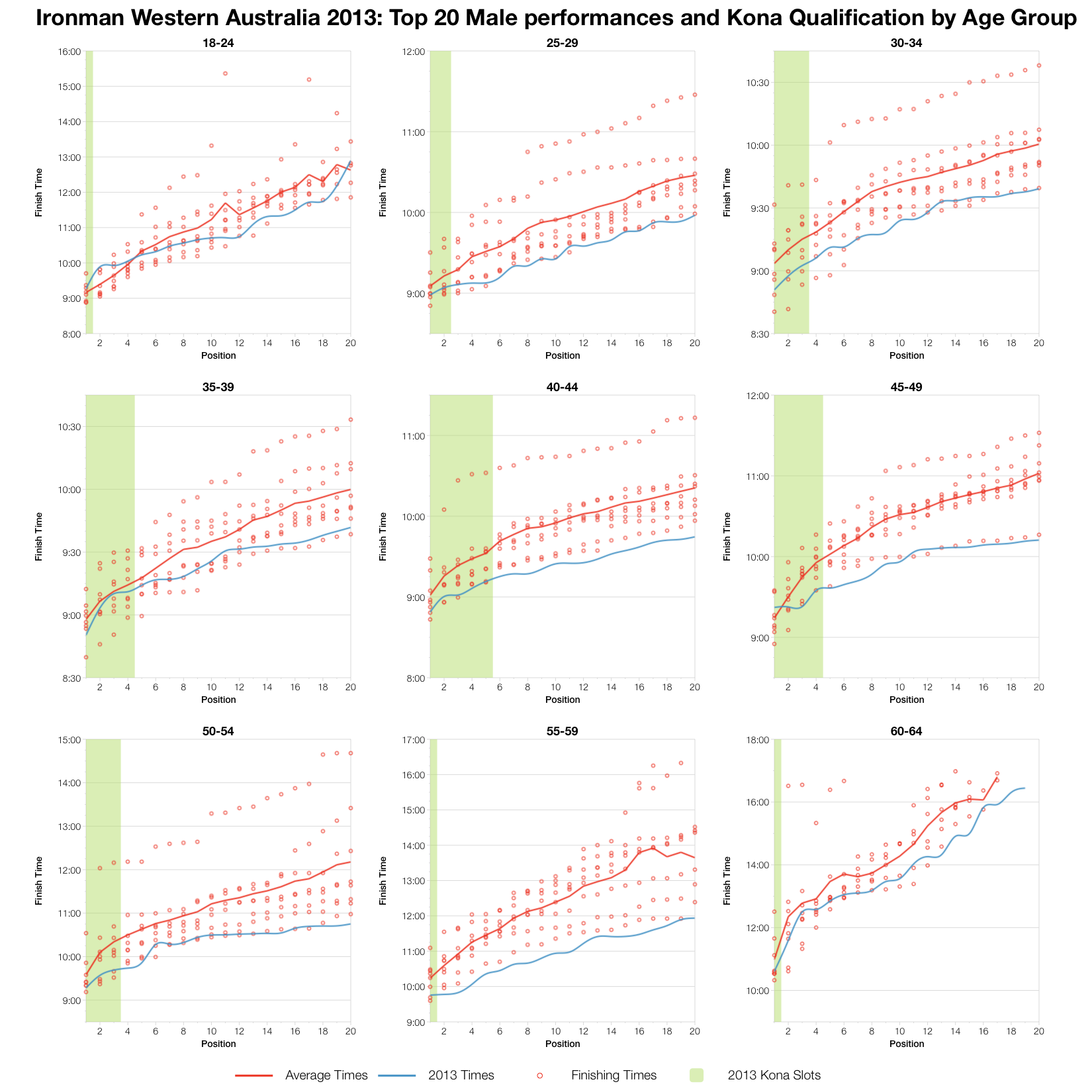
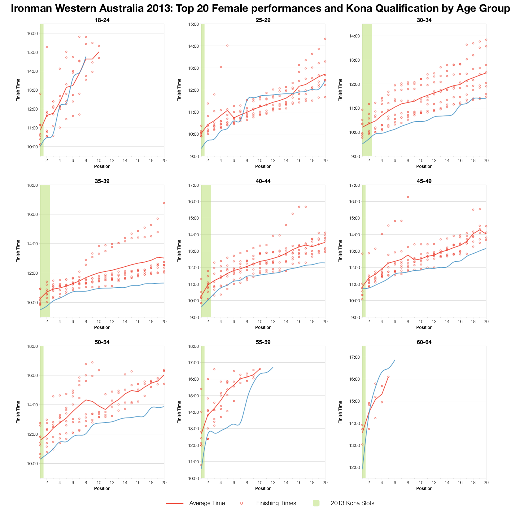
To finish, the top twenty performances within each age group demonstrate that, this year, the front of pack were racing well – times aren’t necessarily the fastest seen at Busselton, but they are up there. The result is that Kona qualification would have certainly required a time under the previous average. Nine hours being the rough guide for men under 35 and 9:15 for men under 45. At the front of the women’s age groups there were some great performances with new fastest times pushing qualification comfortably below 10 hours. Kona slot numbers are based on my estimated slot allocation in last week’s preview post.
While I can observe differences in the pattern of race results I am rarely in a position to comment on causes. Perhaps the conditions in Busselton were favourable this year, or maybe the athletes were particularly good. It’s likely to be a mix of both factors, but from the other side of the world I can’t say. Sometimes I have athletes racing an event who can give me insight, occasionally I get comments from those who raced. It’d be nice to get more of those, to expand the examination of the race beyond a comparison of charts. Even if it contradicts everything I say!
For those interested in the details I’ve uploaded the full results and splits for Ironman Western Australia 2013 to Google Drive.


